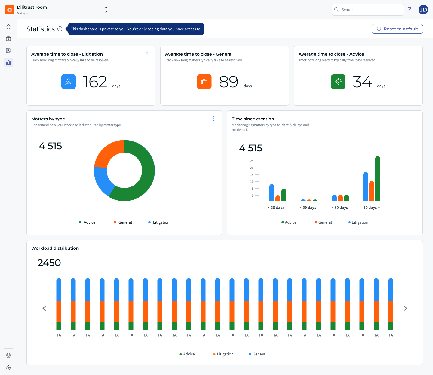
The Statistics screen in Matters is becoming Analytics: a personal, customizable dashboard. Instead of a fixed set of charts, your dashboard is now made of widgets you can rearrange to fit the way you work — and you can ask Lini to create a new widget for you just by describing what you want to see. No more exporting your matter list to Excel just to understand what is happening across your matters.
⭐ What's new
- The Statistics screen is renamed Analytics.
- Your dashboard is now personal and customizable: every visualization is a distinct widget you can add, remove and drag-and-drop.
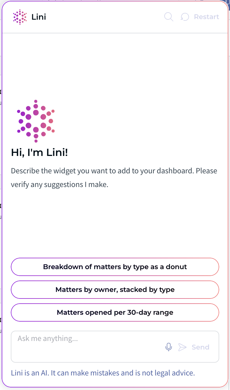
- You can create a widget with Lini by describing what you want to see in natural language.
- You can download any widget as a .png image and export its aggregated data to Excel.
- You can reset the dashboard back to its default state at any time.
✋ Before you start
- Access: the Access Analytics permission is available to Admins, Contributors and Readers, so all roles can open the Analytics screen.
- Customizing for yourself: Admins, Contributors and Readers can all customize their own widgets. Your customization applies only to your own dashboard and never changes what your colleagues see.
- Setting the default: only Admins can define the default dashboard that every user starts from.
- What you can see: a widget only aggregates the matters you have access to. For example, if you can access 49 of the 50 matters on your tenant, a widget counting "all matters" shows 49, not 50.
☝ Your dashboard and its widgets
When you first open Analytics, you start from a default dashboard defined by your organization. It includes ready-to-use widgets that help you anticipate your team's workload, such as:
- Average time to close — the average time it takes to conclude a matter, by matter type.
- Matters by type — how many matters exist for each matter type.
- Time since creation — how long matters have been running, over time.
- Workload distribution — how many matters each user owns.
There are two kinds of widgets: Indicators (a single aggregated value, such as a total number of matters or total spend) and Charts / Timeline (breakdowns or trends over time, such as matters by type or requests over time).
⚡ Create a widget with Lini
To add a new insight, describe what you want in plain language and let Lini build the widget for you. For example, if you type "Show me the number of matters by assignee for litigation matters", Lini creates a chart that counts matters, grouped by matter owner, filtered on the "Litigation" matter type, and displays it as a pie chart.
Lini can typically understand:
- the calculation — a count (number of) or a sum;
- the data source — Matters, Spends or Custom tables;
- the breakdown — when you ask to group results (for example by assignee or by firm);
- the filters — when you specify a subset of data (for example a matter type);
- the display — the most relevant chart for what you asked.
How it works:
- Lini shows you a preview of the widget. You can accept it as is, or ask Lini to refine it.
- If your request is ambiguous, Lini proposes the most likely valid option (for instance, mapping "region" to the closest available field). If nothing suitable exists, Lini explains why and asks you to rephrase — for example: "I'm sorry but I couldn't find a 'region' in the available filters or a similar field. Do you want to display the list of fields?"
✨ Organize, export & download
- Drag and drop widgets to rearrange the layout.
- Remove any widget you no longer need.
- Download a widget as a .png image, ready to drop into a presentation.
- Export a widget's aggregated data to Excel.
- Reset the whole dashboard back to its default state whenever you want a fresh start.
⛔ Limitations & known constraints
- Each dashboard is personal. Your layout and widgets are yours only; customizing them does not affect other users.
- Widgets only reflect the matters you can access, so two users may see different totals for the same widget.
- Only Admins can set the default dashboard shared as the starting point for all users.
❓ FAQ
Where did the Statistics screen go?
It's now called Analytics. It keeps everything you had before and lets you customize it.
How do I add a new widget?
Ask Lini to build it: describe the insight you want, preview the result, and accept it.
Will my changes affect my colleagues' dashboards?
No. Customization applies only to your own dashboard.
Why does my colleague see a different number than me on the same widget?
Widgets only count the matters each person has access to, so totals can differ between users.
Can I go back to the original dashboard?
Yes. You can reset the dashboard to its default state at any time.
Can I use my dashboard in a presentation?
Yes. Download any widget as a .png image, or export its aggregated data to Excel.
Was this article helpful?
That’s Great!
Thank you for your feedback
Sorry! We couldn't be helpful
Thank you for your feedback
Feedback sent
We appreciate your effort and will try to fix the article